Thursday, 19 February 2015

Music ♰

Music sheet cover for 'The Ratcatcher's Daughter', 19th century.
Museum no. S.2768-1986, © Victoria and Albert Museum, London
Music halls can be traced back to the taverns and coffee houses of 18th century London where men met to eat, drink and do business. Performers sang songs whilst the audience ate, drank and joined in the singing. By the 1830s taverns had rooms devoted to musical clubs. They presented Saturday evening Singsongs and Free and Easies. These became so popular that entertainment was put on two or three times a week.

For more middle-class clientele song and supper rooms opened in the 1830s. They served hot food and provided entertainment until the early hours of the morning. Rooms like The Coal Hole, off the Strand in London soon developed a scurrilous reputation. At Evans’ Song and Supper Rooms in Covent Garden singers were paid £1 a week and free drink. The star of Evans' Song was Sam Cowell who was most famous for his song, 'The Rat Catcher’s Daughter'. It was so popular that fellow performer Charles Sloman, who was famous for improvising lines off the top of his head, wrote an extra two verses. Sam Cowell was brought up in America but came to Britain in 1840 where he worked as an actor in Scotland and then London. After a few years of hard graft in the theatre, Cowell began to move into comedy character songs fashionable in the music halls. He was best known for his cockney songs such as 'Villikins and his Dinah' and 'Billy Barlow', but he also burlesqued serious dramas including a version of 'Hamlet' in doggerel. While enjoying considerable popularity in Britain, Sam accepted an invitation to do a tour in America which turned out to be a disaster. Poverty, a harsh winter, and alcohol destroyed his health and he died young, as did many performers of his generation who drank. He was only 45.

The taverns, saloons and supper rooms would have been noisy and difficult places in which to perform. The audiences chatted throughout the acts and could be very unruly often throwing things at the performers – bottles, old boots, even a dead cat. Industrial towns favoured hurling iron rivets. In some halls, bottles carried by the waiters were chained to the trays and the orchestra was protected from the missiles by steel grilles stretched over the pit.

While women were not allowed in the middle-class song and supper rooms, working-class women went to the taverns. In the early days they would often accompany their husbands and bring along their children and even babies. Charles Dickens declared in disgust that the pit had became ‘a virtual nursery’.

The Green Gate Tavern, print, 1854. ©
Victoria and Albert Museum, London
The Green Gate Tavern on London's City Road was a sort of Victorian pub theatre. Many public houses put on entertainment of one sort or another, usually involving music and comedy.

This image from 1854 shows a scene from a play called Paul Pry by John Poole. The play's central character was an idle, meddlesome anti-hero. Not many of the audience seem to be at all interested in what is happening on stage. Just opposite the Green Gate, a rival pub was the Eagle, one of the most famous early music halls which was doing a roaring trade by 1854.


Vam.ac.uk,. 'The Story Of Music Hall - Victoria And Albert Museum'. N.p., 2015. Web. 2 Mar. 2015.

Continuity in the TV and Film industry ♰


The picture on the left shows an example of a continuity sheet that is very important while trying to re-create a look. It helps you to remember all the necessary products needed to create the look which you have to do several times while being on the set. Continuity is very visible on the screen as everything is x10 bigger so you have to make sure every detail stays the same as it WILL be visible.

"Continuity in the makeup department is specific to keeping the look of the actor in the scene consistent when it is shot over several days. As the makeup artist, it is your job to provide the EXACT same look every time that scene is shot regardless of the day, time, location or conditions when you are working with that specific actor."

source: 
https://suzettemariel.wordpress.com/2011/05/26/how-makeup-continuity-on-set-can-help-your-beauty-workflow/

Why do I think continuity is important ?

I think continuity is a very important element when it comes to both- TV and Film. Certain looks give you an idea of a character and represent a lot about them- who they are, how old they are, what their situation is as well as many other important things. Changing that and breaking the idea of continuity would also break that chain of the audience believing in the character and seeing what it is suppose to be seen as. 

Continuity Errors ...

Continuity error is when there is no consistency in a film.  
https://jordansumray.files.wordpress.com/2011/
10/screen-shot-2011-10-12-at-10-07-532.png
This screenshot is from a famous film Pretty Woman and shows lack of continuity as the food changes from a croissant to a pancake in the next shot. 

The photo below shows a shot from American Pie in which we can see that the cup held by the girl changed from blue to clear.


http://www.moviemistakes.com/images/
mistakegrabs/295.jpg

The photo below shows a screenshot form Twilight and a very visible mistake that was so easy to avoid! Bella's hair in the first photo is out of the hood and in the second one, it is inside the hood. 

https://illuminutti.files.wordpress.com/2014/04/
mistakes-in-the-twilight-movie.jpg?w=627

All these continuity errors could have been avoided so easily if notes had been taken correctly. Big productions like this lose reliabilty in the audience eyes in my opinion as it shows their professionalism levels are not that high. If that much money is being spent on a film, surely they can hire someone to make sure things like this do not happen... right? 


Thursday, 12 February 2015

Victorian Jewellery ♰

I am a big fan of any type of jewellery... The weirder the better! 

While researching the Victorians I came across this... Jewellery made to remember and to pay respect  for a loved one that has passed away. This type of bracelets, rings etc was very expensive. Expensive enough for people to come up with an idea for a black market.

What they used to do was place a lock of hair which was usually braided into a piece of jewellery. The item could have even been engraved with the person's initials or date of their death.  The jewellery was also associated with a persons loved ones and as a 'prove' of their love. A personal message may have been engraved on a ring or an anniversary date.

I have found some amazing pieces, which I absolutely love and adore. <3 The quality of this jewellery is amazing and the idea of it is even better. Another little thing about the Victorian era that I just fell in LOVE with. Amazing. 

Black enamel - love love love. Amazing shape, and the quality is incredible!

I really like the way they mixed two types of hair here. Two people?

This is breath taking... The combination of the pearls and the
almostwhite blonde hair on this bracelet make it so feminine and meaningful 


Hair creating a shape of a wave... 

This looks so personal

MY FAVOURITE. This looks so classy, reminds me of Coco Chanel..
The creamy white and glossy black. Incredible!


Source of the images: http://www.corvusnoir.com/blog/2011/08/victorian-hair-jewelry.html


Death Masks- Victorian Art of Dying... ♰

http://i.kinja-img.com/gawker
-media/image/upload/s--f-PmCvvJ--/c_fit,fl_
progressive,q_80,w_636/18khxk4dm3bx7jpg.jpg
It amazes me how much Death meant to the Victorians and how it was celebrated... How much of a meaning it had. The most intriguing thing is that even though that era has ended, most elements of the process of saying goodbye to our loved ones, have stayed the same. For instance the fact that we were black after someone's died- which is suppose to represent mourning,a practice taken up wholeheartedly by Queen Victoria after the death of her husband Albert. However, with fabrics and colours changing over time to mark how long it had been since the death of your loved one. Also, funeral and memorial cards are still produced and distributed. Another thing that I found interesting was that the Victorians valued the last words of the dying a lot, which until this day is still something that all of us do. Even in films we hear 'his last words were...'. Men's attire was fairly simple: mourning coats early on in the period and black bands on their hats and black gloves later. Women’s mourning attire would often consist of a black crepe dress, complete with black caps and even black ribbons tied to the underwear. Later during a period of “half mourning” women would be permitted to wear purple or grey. In addition to this women were expected to be isolated in mourning. Where men might be able to work through their grief, women were expected to stay at home, with visitors only allowed after the mourning period was over.

The importance of some traditions from the Victorian era has not gone even though the era itself has. To me that is very fascinating.

Facts taken from: http://www.history.co.uk/study-topics/history-of-death/victorians-and-the-art-of-dying
Death Mask #1
                   
In lesson we were asked to create a Death Mask, which had to represent a dead person's face. I found this quite hard... It was tricky for me to find the balance between the highlight and shading. Knowing where to put which so that it looked realistic and made logical sense. I have used a black shade of eyeshadow from #Inglot and a white eye shadow from the #Kryloan pallet. If I was doing this again, I would definitely pay more attention to where the light falls on my face naturally instead of having to guess and think 'is this even going to look real?'... You know, instead of theatrical!

Death Mask #2


This Death Mask looks the most realistic in my opinion. I think the shading could be more dramatic, but I think the left side of my face looks darker and gives off that creepy effect I was going for. I put some highlight in the middle of the forehead to represent the light that was directly hitting my face, which I think added to this look as a whole. Now looking at the photograph I think I should have emphasised the eyes more and make them more 'dead looking'. I.e. more dark circles!

Thursday, 5 February 2015

Films With Early-Late Victorian Hairstyles ♰


North & South - 1851 

http://www.imdb.com/title/tt0417349/
North & South -1851

North and South is a four part adaptation of Elizabeth Gaskell's love story of Margaret Hale, a middle class southerner who is forced to move to the northern town of Milton.

This series operates on many levels. At the heart of the series is the tempestuous relationship between Margaret Hale, a young woman from a southern middle class family who finds herself uprooted to the north, and John Thornton, a formerly poverty-stricken cotton mill owner terrified of losing the viability of his business. Around them are class struggles between the workers and mill owners and ideological struggles between the industrial North and the agrarian South. After moving North, Margaret's father befriends his student Mr. Thornton. 

Source: http://www.imdb.com/title/tt0417349/
http://images5.fanpop.com/image/photos/32000000/North-
and-South-north-and-south-32024244-1920-1080.jpg

This is quite an early to mid Victorian hairstyle. All of the hair is up and the parting is in the middle. We can see the curls being pinned up to create this 'bun' look, at the back. This hair style is very feminine and comfortable for a woman. It goes well with the Victorian outfits and the idea of an 'ideal woman' as it is not too outgoing and loud. Its subtle and appropriate, especially with its lack of decoration. The man's hair has been kept very simple. It is thick, black and the hair cut is very average. However the side burns have been created to create this 'Posh' effect that suggests something about the character in this film. 

Cranford - 1840

http://lh6.ggpht.com/_JtIAGz1xvjc/S0fLT_
f7qPI/AAAAAAAAAH8/j9S5KXYyC3c/
s1600/Cranford_poster.jpg
In the 1840s, Cranford is ruled by the ladies. They adore good gossip; and romance and change is in the air, as the unwelcome grasp of the Industrial Revolution rapidly approaches their beloved rural market-town. 


http://lh6.ggpht.com/_JtIAGz1xvjc/S0fLT_f7qPI/AAAAAAAAAH8/
j9S5KXYyC3c/s1600/Cranford_poster.jpg


In the photos above we can see a lot of hair up-do's which were very popular in the early period of the Victorian era. The hats remind me more of the working class as they represent the fact that those women simply did not have enough time to do their hair in the morning. Such a modern excuse,ey. 

Our Mutual Friend - 1860

Intertwining tales of love, greed, and secret identities in Charles Dickens's 1860s London.

http://www.imdb.com/title/tt0144727/
"The tongues of London high society gossips begin to wag when John Harmon --a young man whose inheritance depended on his marrying a woman he had never met-- is found dead in the River Thames. The fortune passes into the hands of the working-class Boffins, who take into their new home both Bella Wilfer (Harmon's would-be bride), and a mysterious secretary known as Rokesmith. Meanwhile, Lizzie Hexam, the daughter of the boatman suspected of Harmon's murder, is pursued by two suitors: obsessive and self-righteous Bradley Headstone and roguish and lethargic Eugene Wrayburn. An expansive and varied cast of characters create an epic intertwining tale."

http://4.bp.blogspot.com/_FOXStASY67Q/TJwuIWMhnlI/
AAAAAAAACOU/LijwqJol6FM/s1600/866276607.jpg


By looking at the photo on the right we can see the family is quite wealthy.. the clothes and all the accessories included in the photo, i.e. th hat in the middle represents higher class.

These series do not represent the Victorian era when it comes to hairstyles very clearly- they are all mostly hidden under hats or head pieces very popular in that particular era.

Tuesday, 3 February 2015

High Definition Broadcasting ♰

"HD stands for High Definition – HD TV offers higher-quality pictures, greater detail and crisp, vibrant colours. A standard TV picture is made up of 576 horizontal lines, but an HD TV picture uses either 720 or 1080 horizontal lines to give you the picture improvements."

Source: www.radioandtelly.co.uk/hdbasics.html

http://1opx.com/wp-content/uploads/
2012/09/hdcomparison.jpg


http://welcometotwinpeaks.com/wp-content/uploads/
cooper-annie-2-blu-ray-before-after.png

Too much makeup can appear really obvious on HD. Cleansing, toning, moisturising and evening out the hydration of the skin is very important for HD. The better we prepare the canvass, the better the make-up will look.

Preparing the face
Many make-up artists believe that you need to use specialised cosmetics or make-up techniques for work in high definition. That’s simply not true. As long as you work to film standard, most of the makeup in your kit will work just fine in HD. However, employing airbrush techniques can give you a distinct advantage, so eventually you may wish to invest in an airbrush kit.

Airbrush cosmetics are made from micronized pigments that are far less detectable on camera. An airbrush kit contains a mini compressor. When switched on, this expels compressed air. The finish can be very lightweight due to the atomisation of the cosmetic. This is what gives the illusion of flawless skin and why airbrushing is so fast and synonymous with HD.

Another bonus of airbrushing is the length of wear. It tends to last longer than conventional makeup, and needs less retouching throughout the day.

The product is easily blended and leaves no hard lines of demarcation, so there’s nothing to distract the audience. If you have hotspots, you can lightly dust the area with transparent powder to lessen the shine.

You can also use the airbrush for highlighting, contouring and even to apply blusher. Poorly blended blusher looks terrible in HD, so use airbrushing to smooth out any imperfections.

Setting powders
One product that can sometimes prove problematic in HD is traditional setting powder. Although frequently invisible to the naked eye, these non-micronized powders can sometimes give the skin an ashy, dull caste on camera. Specialised HD setting powders are available in both loose and pressed forms to combat this problem.

Final checks
Most make-up artists working in television will be used to checking their work in the mirror, because in standard definition, as a general rule of thumb, the mirror sees what the camera sees. However, with High Definition, just as in film, you also need to eyeball the make-up closely. Any problems apparent to the naked eye will also become apparent on HD and film.

Source of information about HD make-up: http://www.bbc.co.uk/academy/production/article/art20130702112136285

Personally, I am a big fun of this new technique. I feel like TV has moved forward a lot and it could almost be compared to real life when it comes to the quality. I like how it draws attention to every detail, so naturally... And how make up artists have to deal with that haha! Fine with me, pros of being a perfectionist! TV is the sort of industry, I would like to start my career in and these kind of things make me look forward to it a lot as that means many challenges :) which mean learning and gaining even more knowledge. I'M EXCITED!

Analysis Of Miss Havisham's Character ♰


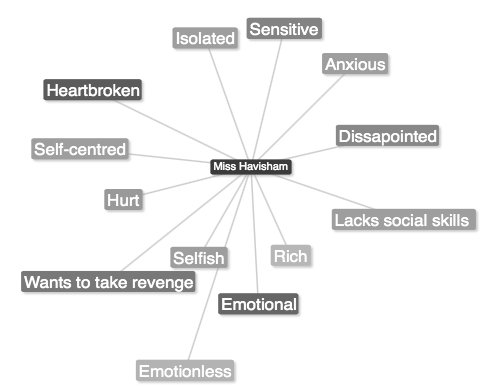
This is a mind map that I have done to break down Miss Havisham's character. It helped me to focus on her individual characteristics and help to build a new visual form of that specific person from the book. 

For example, the fact that she was isolated means she stayed at home and didn't meet up with anyone outside her house... This would affect her physical appearance as it means she should be pale as she did not expose herself to sunlight and socially deprived, because she stopped exposing herself to that too. This would make her anxious, which could mean marks on her skin, a specific posture. A different posture would be a good way of showing for example an eating problem that Miss Havisham was very likely to experience as stress and anxiety are factors that could highly influence that. 

I see that character as a very ghostly looking one but with visible pain on the face... By this I mean, visible veins, a lot of wrinkles, especially in the eye area, as this would show she cried so many times. I see her hair as quite white,messy, with old wedding decorations/pieces in places. 

Harlequin Goth Fashion: Vogue Italia's Black Widow Couture ... ♰


1
2


4
3


This Italian Vogue editorial from October  2008, shot by Greg Lotus, in my opinion has been based on this 'Black Widow' look that can be very feminine but firm at the same time, making it very interesting. The models are dressed in see-through black lace, chiffon, long evening gloves and parts of their faces are adorned with very elaborate and artistic paint. The photos have been shot in black and white adding this mysterious factor to this shoot. I find these photos edgy and very feministic. Each image seems to represent part of an intriguing and seductive story. 

The make up is either very bold and acts almost like a massive statement and is rather out there, or in some photos it is hardly visible. I find this very interesting, how they played with the perception of the word 'Gothic'... and made it look glamours and feminine.

Make up wise, in the first photo we can see that the make up has a hint of pink, which automatically screams girly/playful/feminine... Then, we see this dark side which is the outfit, the pose, the hair. This contrast makes the photo so much more interesting! Also, half of her face looks like its decaying... She is holding an hourglass which could mean she is counting the days. There is many  possible interpretations of this photo, which I think is very fascinating!

The second photo represents a grown woman who is also a bit edgy. Contrast- again. The hair she is wearing is very asymmetrical which combined with the pose of the model- adds some character to the photo. The make up is also very brave- dark eyes and lips. Not very feminine, but makes a statement. The very heavy looking necklace could represent her being able to carry all the wight on her shoulders because she is that confident in herself.

Photo number three is my personal favourite... The model looks like she is trying to almost blend with the texture of lace, hide behind it. Is she shy? Maybe... The way she is posing could support that assumption. She looks young, but also quite worried... But when you think young, you think reckless.  This is what I find interesting in this photo... It puts too opposites together, and makes them look good by also emphasising things such as the make up.

In photo four I see a motherly figure. Pale, make up-less face, holding grapes... This adds a bit of an abstract element to the mood of this photo and makes you wonder what it could symbolise. In my opinion grapes have an interesting shape and colour and they also symbolise food, which at the start we get provided by our mothers. However, it has been made to look classy, feminine but it still sends the message!

I think these photos are very powerful and I absolutely adore the whole atmosphere that these outfits, make up and models create. 

Source: http://www.trendhunter.com/trends/goth-fashion-shoots-vogue-italias-retro-modern-fashion

Ideas for interpretation of Miss Havisham ♰


https://s-media-cache-ak0.pinimg.com/
236x/8d/71/f0/8d71f08e75ce179c245926a
79b2a4de4.jpg


When it comes to Miss Havisham, I have a clear view of what I want to do because this is how I imagined her to look like while reading the novel... I would like to emphasise what was made natural both in film and TV series, the visual adaptations of the book. 

For example, the fact that she does not leave her house, means she is not exposed to sunlight... This to me immediately suggests pale skin, quite dry as well= Dewy foundation is not an option!

I want to emphasise the eyes. Make them seem sad, tired. With this look I would really want to show every emotion Miss Havisham feels and represents with her character. I think it's very important to include that in the make up especially in film as it adds to the story and the character's background. 

The photo on the left shows the kind of look I would want to do-  bold make up on very pale skin. However, I still want to keep that element of Miss Havisham there and not make it look like it is a look for a fashion show. I have done a face chart to show my idea inspired by the look above.

*the lips would not be as pink/ but instead more subtle and pale 
Front & Back of the Hair
The drawing on the right shows my idea for the hair. I would like it to be quite a messy hairstyle as Miss Havisham did not really look after herself very well...

However, I still want it to include Victorian elements such as curls at the bottom. I have only kept them at the bottom because I want it to look like they have dropped as she hasn't done her hair in a very long time...

I feel like this would represent the circumstances of Miss Havisham's situation and represent her as a character well.

I will also add some white spray in some areas of the hair to create an effect of the hair going grey and show that she is getting older and older but still living the past, which was very stressful and heartbreaking. This could very well be represented by grey hair in my opinion.


My second idea for Miss Havisham is a very contoured by still naturally looking. This face chart shows my idea:

I wanted to keep it very simple as Victorians did not pay much attention to make up and it wasn't a sign of anything. The plainer the better. However, I think of Miss Havisham as a very anxious and thin character therefore I think some light contouring is essential. Nothing too visible, but definitely defying because of the need for representation of the character.

On the skin I will put the lightest shade of foundation from the Kryloan foundation palette, just to create that ghostly look but still cover any imperfections. This is because even though Miss Havisham did not take care of herself, I still see her as a beautiful woman that was in love but it wasn't the kind of love she expected. 


My next idea for Miss Havisham focuses on the conditions she lives in, what she went through and what kind of a person she is. The make up is quite neutral but still emphasises the circles under the eyes and adds depth to the face. Like I said earlier I imagine Miss Havisham to be quite thin so drawing attention to the cheekbones I think is a great idea. 


Below I have inserted a photo to demonstrate the eye more. I would like to include wrinkles around the eye area to symbolise Miss Havisham's age as well as health state. I want them to be visible as I think details like that say a lot about the character and their story and I would really like to represent that through my work.


- More Ideas for Hair - 

I have looked on the internet for some wigs, which I thought were suitable for Miss Havisham. The one on the left is appropriate because it is grey and messy as well as curly which represents the Victorian era! The curls aren't neat which would suggests that Miss Havisham couldn't be bothered to do her hair, which is exactly what it was like. The hair is also lots of different shades of grey which I like as it shows that the hair has been slowly turning grey naturally.

The only thing about this wig is that the parting is not in the middle, which might not look right on Miss Havisham as it wouldn't represent the era in the correct way...


The wig on the right I have also found on the internet, and this one I really like because it has the correct parting. However, the hair looks a bit blue but that could easily be changed by dusting some white powder over it or even going through the hair with a bit of white from the #Kryloan supra colour palette!

I like how messy it is and that the hair is long which automatically makes me think = no hair cut for years! This is the kind of effect I am going for and so far this is one of my favourite ideas for the hair!


Another idea for the hair has been inspired by the tradition Victorian hairstyle which was one of the firsts I have ever done.

I decided to make it a lot messier as Miss Havisham did not care about the way she looked in the book and I wanted to represent that with her hair and the make up. I have practised my final look on the model:


Gothic photographs ♰


Anything and everywhere could be Gothic if you only looked at it through these black shaded glasses. 

It doesn't have to be a graveyard or a church with a moon in the background but also textures, shapes or even lightening. I have taken some pictures which put my idea of Gothic into something more visual then just words. 


©Sylwia Mazur 
This photo was taken in one of the Southampton parks. I thought that this tree created this mysterious atmosphere with a bit of feeling of the 'unknown'... I could see it as a part of the setting in the Great Expectations or any other 'gothic/horror' styled movie. 

I like how much of a contrast this photo has, which could possibly represent good and evil. We can see this decaying tree with a bright sky in the background, which could represent freedom or maybe even hope, as we don't see any clouds... 
©Sylwia Mazur 


The photo on the right was taken at a graveyard which I visited first. However, to me it felt very limited when I was thinking about it as a Gothic inspiration. 

The thing I really like in this photo is all the visible textures- the grass, the cement of which the graves have been made of, the trees and the sky. 

©Sylwia Mazur 

The photo above is one of my favourites. I took in on a sunny day on my way to dinner. Who would have thought! I just imagined the sun in B&W and used my phone to take it. The clouds added a lot of mystery to this photo making it look very gothic... The building has different textures on it which I thought was very interesting as it added character to it and at the same time- the photo. It created this dark mood looking photograph which I think could be one of the scenes from a horror film. 

©Sylwia Mazur

The photo on the right was taken in a pub in Southampton. I thought the curtains and the wooden bits on the walls had a lot of that Victorian feel... 

It's funny how anywhere I go now, I see something from that era, or inspired by it. It's beautiful in a way how now we think something is modern but in reality after doing some research, we realise it has been done before and we just adapted it to what we like now. 

There is also a woman figure made out of wood on the left which adds a bit of that ghost element to this photograph... She looks like she is floating, which makes me really like this photo because of the element of realism which it carries.